(Jeff Abbott is a regular contributor at The Pen Addict. You can find more from Jeff online at Draft Evolution and Twitter.)
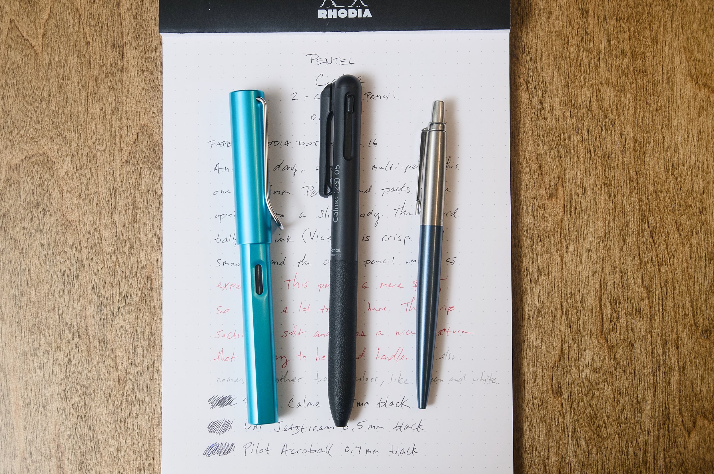
If the eight-year-old version of me knew how many different types of great multi-pens would exist in the near future, I'm not sure I would have believed you. At the time, the only multi-pen I was aware of was the standard Bic 4-Color. It was great when it was the only one in my realm of awareness, but today is a totally different story. There are almost too many multi-pens to choose from, and so many of them are really good. The latest multi-pen to find its way to my desk is the Pentel Calme.

The Calme comes in a few different versions and colors, but this one is a black body that includes a black and red 0.5mm ballpoint cartridge, as well as a 0.5mm mechanical pencil component. Until using this pen, I hadn't tried Pentel's hybrid ballpoint ink formula, which they call Vicuña. Similar to Jetstreams and Acroballs, the ink is smooth, consistent, and creates sharp lines when writing.
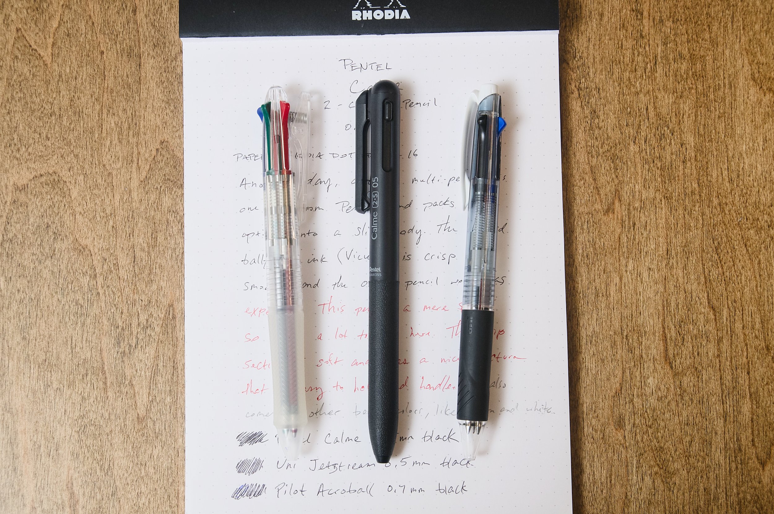
When it comes to multi-pens on the cheaper end of the spectrum, it's been my experience that they are typically a bit chunky and have a larger diameter barrel. With the Calme, it's actually a good deal smaller in diameter than its direct competitors, like the Jetstream or Acroball 3-component options in the same price range. I don't mind the larger diameter, but I'm sure this can be a downside for some people. The Calme's diameter is closer to a normal pen that you'll find on the office supply shelf. This smaller diameter gives the pen a familiar feel in the hand and makes it easier to handle.

Along with the smaller diameter, the long grip section is made of a soft, textured material that feels great. The texture is easy to feel and provides loads of grip, and the slightly cushioned feel is really comfortable. I doubt this material will stand up to a lot of abuse, but it should do fine for normal use and conditions.

Extending and retracting the refills uses the same mechanism as other multi-pens in this price range. There are a couple of color-coded tabs at the top of the barrel for extending the ballpoint refills, and the clip doubles as the mechanical pencil control. Simply depress one of the inactive tabs to retract the current refill into the pen. The extending/retracting feel on this pen is solid, and I haven't had any issues using it.
As an added bonus (or detriment), this pen does not include a tiny eraser, so you'll need to remember to pack a real eraser if that's something you might need. In my experience, the tiny erasers are pretty useless and only serve to frustrate me, so I won't miss it on this pen!
At $6.75, the Pentel Calme is a great deal and a worthy competitor to the Uni Jetstream, Pilot Acroball, and the like. You can get a 3-color ballpoint version for a little cheaper if you don't want or need the mechanical pencil component. Depending on the barrel color and component options, you can choose from 0.5mm or 0.7mm refills that are included with the pen. And of course, there are gobs of replacement refills that will fit this pen, so your choices are vast in terms of outfitting this pen with the perfect combo of inks.
(JetPens provided this product at no charge to The Pen Addict for review purposes.)
Enjoy reading The Pen Addict? Then consider becoming a member to receive additional weekly content, giveaways, and discounts in The Pen Addict shop. Plus, you support me and the site directly, for which I am very grateful.
Membership starts at just $5/month, with a discounted annual option available. To find out more about membership click here and join us!