Posts filed under Fountain Pens

Sailor Manyo Koke & Pro Gear Slim Summer Rain Review

(Kimberly (she/her) took the express train down the fountain pen/stationery rabbit hole and doesn't want to be rescued. She can be found on Instagram @allthehobbies because there really are many, many hobbies!.)

I needed to ink up one more pen before heading to the Chicago Pen Show this weekend so I decided to ink up the Sailor Pro Gear Slim, Summer Rain because I needed a teal blue pen in the pen binder when I realized, gulp, that I was supposed to have done a review of this pen and the ink that Brad got from Dromgoole’s at the Atlanta Pen Show … TWO YEARS AGO! Eek! Better late than never right? (Editor’s Note: Kimberly now has a meeting scheduled for Monday, post-Chicago show. -B.D.)

Sailor Koke is a part of a dual shading series that is a continuation of their Manyo line, and includes Fuji, Hinoki and Ayame. There are other Manyo inks which are also dual shaders like my favorite Nekoyanagi, Haha and others, but this series specially says “Dual shading” on the box/bottle and was released around late 2021/early 2022.

Sailor Manyo Koko and Col-o-ring swatches.

As in the past, all swatches were done on Col-O-Ring cards using a Kakimori steel dip nib, while writing samples were done with a TWSBI Go with a Medium nib and a Lamy Vista with a steel Medium nib. The TWSBI Go is a wetter writer and the Lamy is a drier writer, so these two give me a good idea of how an ink will look from different pens. This time around, I also included a writing sample from the Sailor Pro Gear Slim, Summer Rain with a Medium Fine nib. The notebook used for writing samples is from Endless Recorder with 68 gsm Tomoe River paper. Dry times may be a bit slower on 52gsm TR or faster on other papers like Rhodia, copy paper, or with drier or finer nibs, etc.

Sailor Manyo Koke is a dusty teal blue with purple shading. You don’t get much of the purple shading in drier or finer nibs, but you can see it in the larger swatches and smears.

Writing sample on 68 gsm Tomoe River Endless Notebook. You get more shading from the Vista compared to the Saiior or Kakimori, but not as much purple since it’s a drier nib.

Hello, purple! It’s definitely there on the swatch, but you’ll have to take my word that it’s there in the word “writing” too, it’s just impossible (for me) to photograph.

Chromatography of Koke shows the mostly turquoise-blue tones with just a wee hint of purple before shading to yellow.

Inks similar to Koke: Laban Poseidon Green and Diamine Blue Peppermint, both of which were a bit too green and the latter has shimmer, and both Pelikan Edelstein Aquamarine and Papier Plume Carolina in My Mind were a touch too blue.

What makes this color more unique are the purple chromashading as well as the dusty, muted nature of this ink. It was difficult finding closer matches as the inks leaned too green or blue or were too bright or saturated.

Koke dried really quickly with the Vista (less than 30 seconds) but took over a minute to dry with the TWSBI. You can see the purple that’s left over when I did the smear.

Even though this is a somewhat dry ink, it behaved well in the Lamy Vista (the driest of the three pens), the Sailor and the TWSBI Go. I liked the color the most from the TWSBI because its wet line results in the purple chromashading. I didn’t get much if any purple from either the Lamy or the Sailor, though the based color is still lovely. I can’t wait to ink it up in a Pelikan next time.

Moving onto the pen, which is the Sailor Pro Gear Slim, Sounds of Rain series, Summer Rain. It is a Pro Gear Slim that has matte textured cap and barrel with translucent colored finials and a thick gold trim band at the base of the cap. The other pens in the Sound of Rain series is Spring Rain, Autumn Drizzle, and Winter Rain.

At first glance, this seems like “yet another Sailor Pro Gear Slim” but there is one major differentiator - the nib. The easiest way to tell a Pro Gear Slim apart from a Pro Gear (aside from the slight increase in length and girth with the Pro Gear) is that the Pro Gear Slim usually sports a 14kt gold nib, while the Pro Gear has a larger 21kt gold nib. The Sailor Sounds of Rain series pens, while being Pro Gear Slim in size, have 21kt gold nibs, but they aren’t as large as the Pro Gear nibs. This isn’t the first time that Sailor has done something like that but it does make things confusing!

Sailor Pro Gear Slim Nuts, Summer Rain and Pro Gear Mojito.

I aligned the nibs, so you have to look at the bottom to see the length differences, (the first two are the same length and the third is longer.)

The nibs from the PGS Nuts and Summer Rain as the same, even though the latter has the 21kt gold nib. The 21kt gold nib on the PG is bigger (longer and wider) than the other two.

But how do they write? I unintentionally had MF nibs inked up in the two other Sailors, which made it perfect for comparison purposes. I didn’t notice much, if any, difference in line width, nor between the nibs’ stiffness nor wetness. Even the larger PG’s 21kt gold nib didn’t really feel any different from the other two. I know some people will swear that their Sailor 21kt gold nibs are softer/bouncier than their 14kt gold nibs, and I’m not feeling any difference. It’s possible that this is due to my very steep writing angle, so keep that in mind.

These inks (Montblanc, Sailor and Jacques Herbin, respectively) have different characteristics and flow, but the lines were pretty similar.

There is a significant price difference between the Summer Rain series ($450 MSRP, $360 street price) and a different PGS Limited Edition like the Manyo series ($350 MSRP, $280 street price) and that’s primarily due to the difference in nib’s gold content. As I said earlier, I couldn’t really tell the difference between the PGS Nuts’ 14kt gold nib and the Summer Rain’s 21kt gold nib, so whether the aesthetics of the pen justifies the added price tag is a very personal decision. I really like the matte texture as well and I don’t think Sailor tends to do that very often on the regular PGS lineup. But, as you probably already know, Sailor’s gonna Sailor, so it’s difficult to put any semblance of rhyme or reason to their pricing, lol.

Sailor Manyo Koke ink is available at Dromgoole’s for $24.00 for a 50 ml bottle and the Sailor Pro Gear Slim Summer Rain pen sells for $360 on their website. You can also get the Koke ink as part of a 4 - 20ml bottle set for $60.

(Disclaimer: Both the Sailor Manyo Koke ink and Sailor Pro Gear Slim Summer Rain were purchased at a discount from Dromgoole’s. The other pens, inks, Col-O-Rings and notebook are mine.)

Posted on May 3, 2024 and filed under Sailor, Fountain Pens, Ink Reviews, Pen Reviews.

Visconti Mirage Mythos Athena Fountain Pen Review

(Sarah Read is an author, editor, yarn artist, and pen/paper/ink addict. You can find more about her at her website and on Twitter. And her latest book, Root Rot, is now available for pre-order!)

Visconti does a good job of making their version of an entry-level pen feel very fancy. While the $159 price tag of the Mirage Mythos Athena Fountain Pen is far from beginner-friendly, it's a good entry point for those interested in trying out this luxury brand. It's also a perfectly good pen in its own right, and this one in particular has been a delight to write with for the past few weeks. It also comes in a fancy gift box that feels like a whole event to unwrap. It's not as much packaging fanfare as their other pens, but it's decidedly Extra for a pen in this price range. I generally prefer simpler packaging, but I appreciated feeling like it was my birthday for a few minutes.

The Mirage is made from a lightweight acrylic in lovely swirling colors. The Athena is in this gorgeous turquoise with pink, rust, purple, and even a touch of green rippling through. There's a subtle sparkle to it. The color is offset with brass accents on the grip, clip, finial, and cap band, which also has some textured etching. It has the classic bridge-shaped, spring-loaded Visconti clip, which gives it its signature look.

The body of the pen is lightly fluted, which helps with grip and keeps it from rolling on the desk.

The brass grip section unscrews from the body of the pen, and the body is lined with a brass sleeve that prevents a brass-on-acrylic thread connection--a nice detail that will prevent wear and cracking over time. The concentration of brass at the grip does make the pen a little front-heavy, but that doesn't have a negative effect on the writing experience.

The cap closes--and also posts--with a clever magnetic attachment. To close, the magnets pull the lid into some notched threads that keep it securely in place. The seal is good--the pen has never dried out between uses. When posting, the magnet helps secure the pen to the end of the pen, though it's a less secure connection and it rattles a little when writing. It's also quite large when posted. But it can be done! Just don't make any sweeping gestures or the cap will fly off.

The highlight of this pen, for me, is the nib. Visconti has had some nib quality issues in the past, mostly on their very high-end pens, but this gold-colored steel nib is totally dreamy. It writes as smooth as butter with the perfect balance of wetness. It's so pleasant to use that I find myself doodling between thoughts just so I can keep using it when my writing is paused.

This pen has been a delight. It was my solo writing instrument on my recent writing retreat and I cranked out over six thousand words that weekend and enjoyed every minute of the writing experience. I'm very content with this pen, but the good experience does tempt me toward someday trying one the fancier Visconti models. This one will do just fine until I cave to temptation.

(JetPens provided this product at no charge to The Pen Addict for review purposes.)


Enjoy reading The Pen Addict? Then consider becoming a member to receive additional weekly content, giveaways, and discounts in The Pen Addict shop. Plus, you support me and the site directly, for which I am very grateful.

Membership starts at just $5/month, with a discounted annual option available. To find out more about membership click here and join us!

Posted on April 18, 2024 and filed under Visconti, Fountain Pens, Pen Reviews.

Opus 88 Demo 2024 Edition Fountain Pen Review

(Jeff Abbott is a regular contributor at The Pen Addict. You can find more from Jeff online at Draft Evolution and Twitter.)

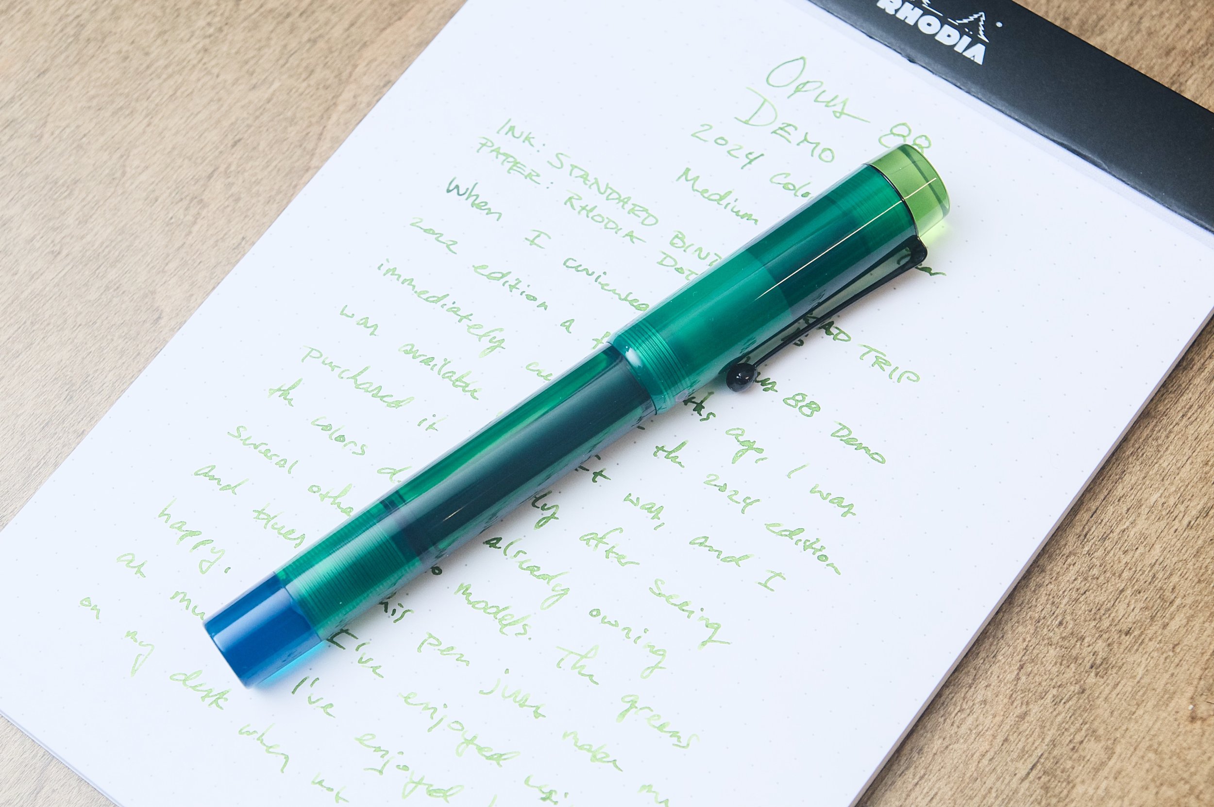
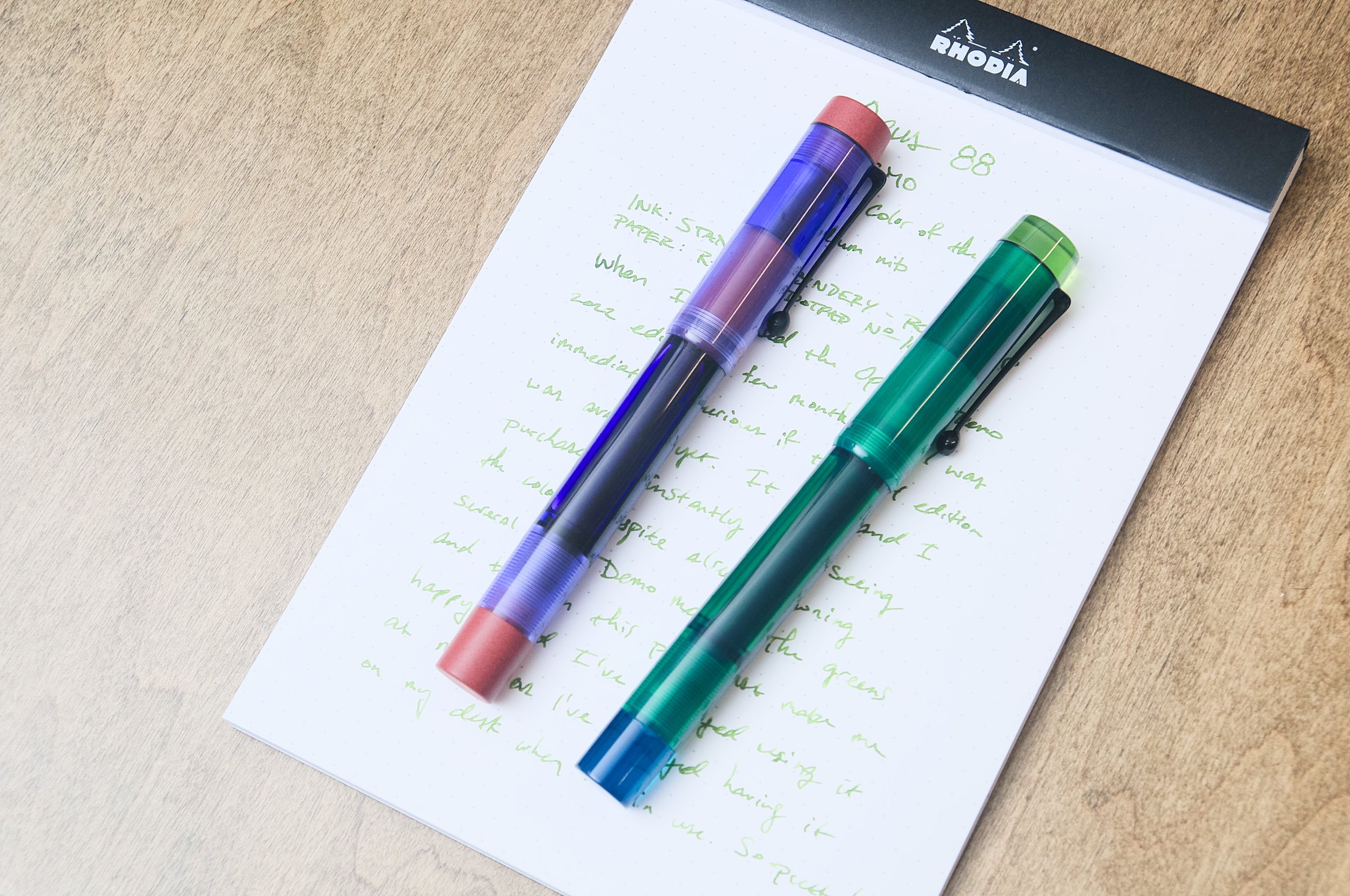
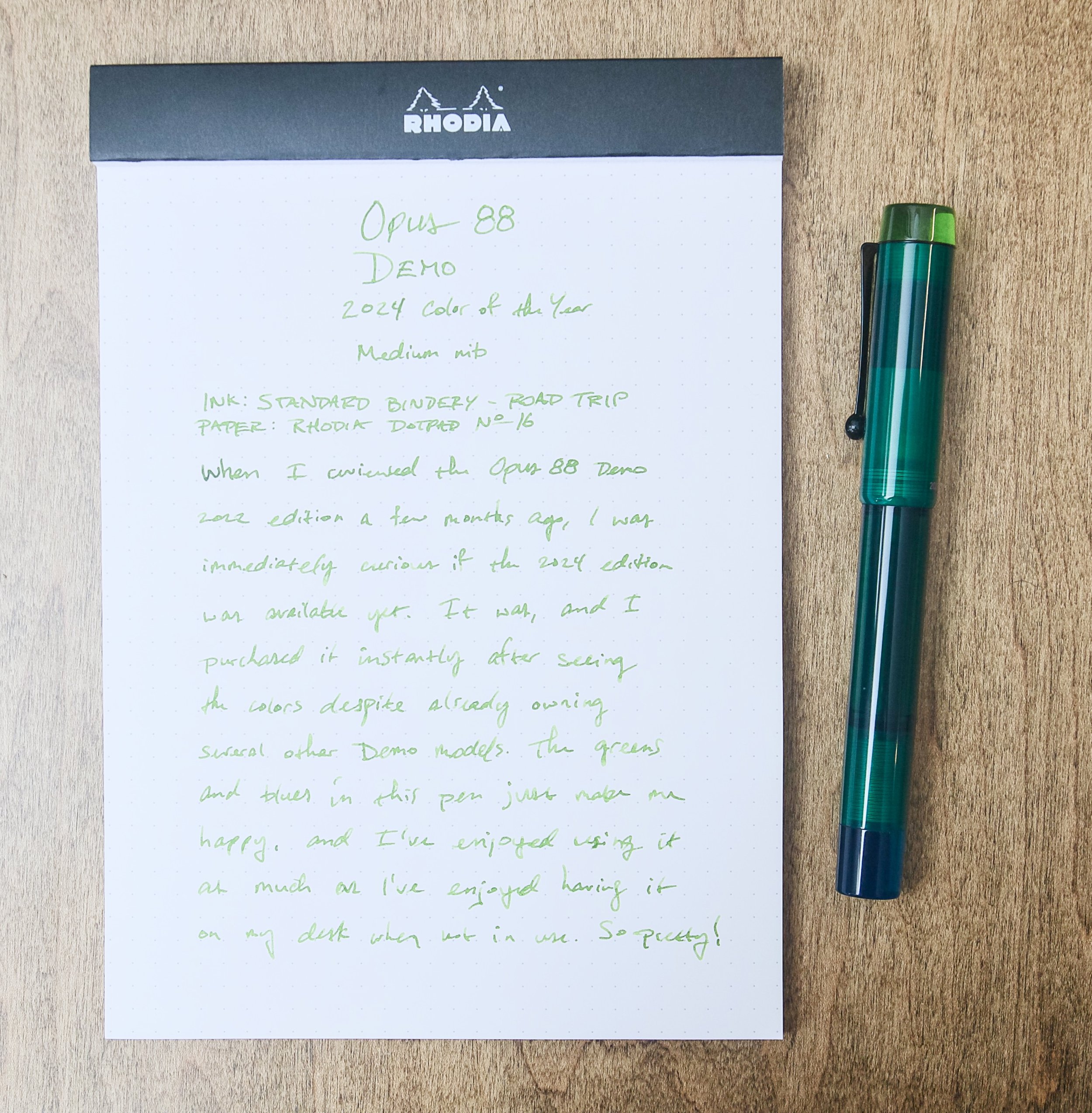
Just a few months ago, I reviewed the 2022 special edition of the Opus 88 Demo, which was a wonderful mix of purple and maroon that I really enjoyed. Before then, I wasn't aware that Opus 88 did annual color editions, so I was curious about whether a 2024 edition was announced yet. Not only was it announced already in January, but it was also available for sale. I immediately bought one after see it on the computer screen because the greens and blues spoke to me so strongly.

Fast forward a few days when I got the pen in hand, and I couldn't be any happier with the purchase. In person, the greens and blues are more vibrant and you can see more of the semi-translucent qualities of the acrylic material. It's not often for me that I know that I'll love something like this before I've even received it, but for some reason I just knew that the colors would be spectacular in person. I'm glad I was right.

2022 vs 2024

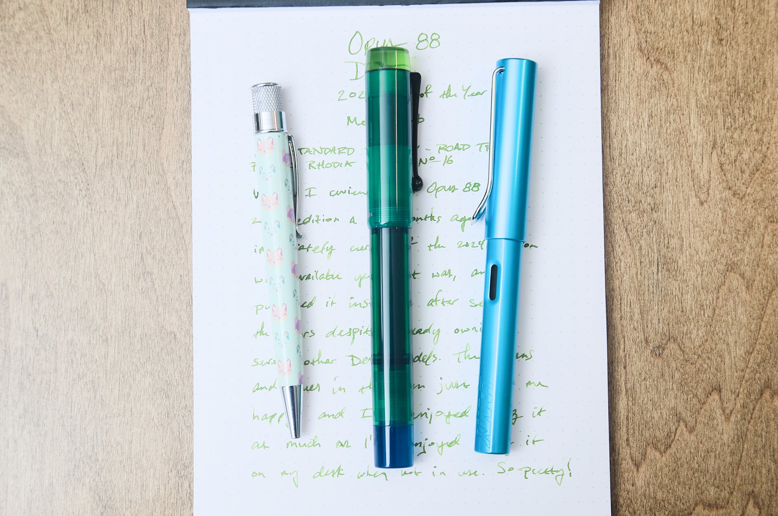
The Opus 88 Demo model has been around for years, and it's one of my personal favorites. I like the uniform barrel shape and mix of colors that I would think might clash but somehow work together. The grip section fits my hand well, and the pen diameter is really comfortable for how I write and hold the pen. On top of all that, the ink capacity is stellar. I don't normally fill these pens up all the way with ink because I normally want to change out the ink before I use it all. But, just having the option of loading this pen up with ink and not having to refill for quite a while is definitely comforting.

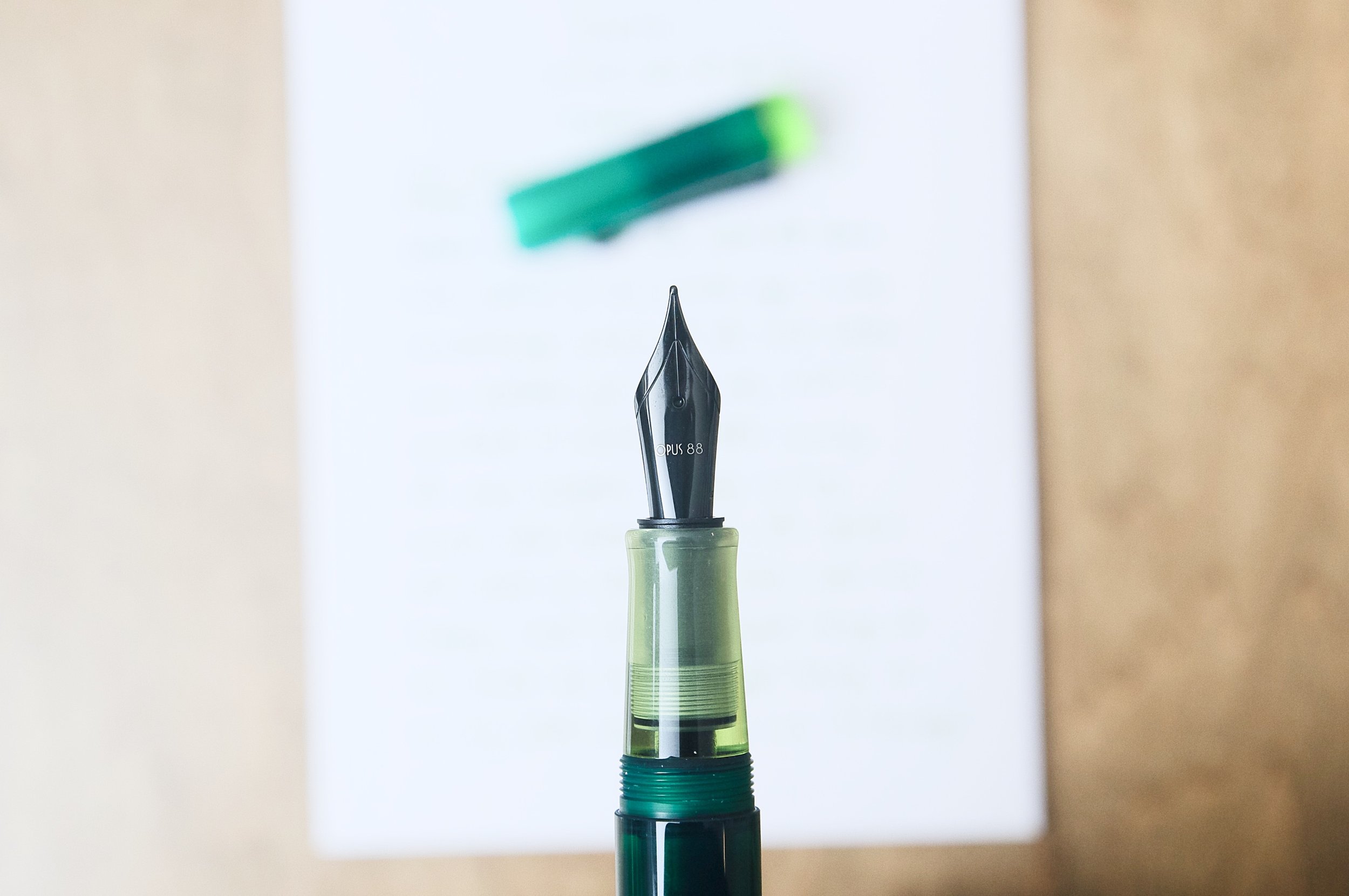
The color scheme for the 2024 special edition is a dark turquoise body paired with green-yellow accents on the cap and grip, and a lighter blue blind piece that you use to open and close the ink reservoir. The colors go so well together, and I love the visual interest that the semi-transparent material adds to the already eye-catching colors. The nib and clip are both a dark off-black color, which go great with the dark hues of the pen body. I think bright metal would distract the eye from the acrylic materials, so I like the dark metal choice.

For this model of the Demo, I opted for a Medium nib. This is a favorite size for me when doing general writing or long-form writing, so the Demo is a perfect workhorse choice for that nib duty. The nib is glassy smooth out of the box, and the flow is perfect. I paired the pen with Road Trip from Standard Bindery, which is a fun ink on its own merit, but it pairs beautifully with this pen.

It's refreshing to see pen companies release fun and new colors for their existing products. Lots of companies do it, but Opus 88 does an exceptional job. Their pens are great quality, affordable for what they offer, and work well. Since I know the pen model is a great baseline, it's easy to make a quick decision on a colorful and attractive model without having used the actual pen before.

If this 2024 Edition of the Opus 88 Demo speaks to you like it did me, you'd better hurry and snag one ($140 as of this review). These are limited stock, and when they're gone, they're gone. If the greens and blues aren't for you, then there's always next year or even the solid selection of standard colorways as well. The Demo is one of my favorite pen models, and this color combination just makes me happy.

(Vanness Pens provided this product at a discount to The Pen Addict for review purposes.)


Enjoy reading The Pen Addict? Then consider becoming a member to receive additional weekly content, giveaways, and discounts in The Pen Addict shop. Plus, you support me and the site directly, for which I am very grateful.

Membership starts at just $5/month, with a discounted annual option available. To find out more about membership click here and join us!

Posted on April 3, 2024 and filed under Opus, Fountain Pens, Pen Reviews.