Posts filed under Ink Reviews

Sailor Manyo Koke & Pro Gear Slim Summer Rain Review

(Kimberly (she/her) took the express train down the fountain pen/stationery rabbit hole and doesn't want to be rescued. She can be found on Instagram @allthehobbies because there really are many, many hobbies!.)

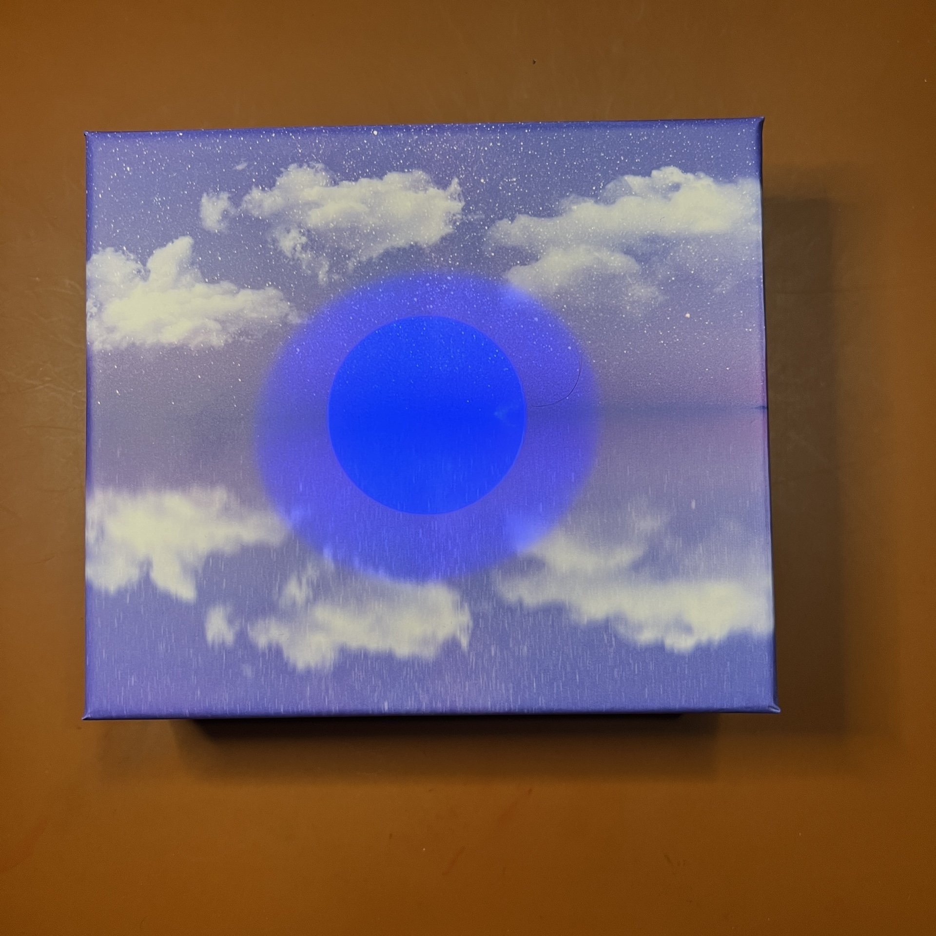
I needed to ink up one more pen before heading to the Chicago Pen Show this weekend so I decided to ink up the Sailor Pro Gear Slim, Summer Rain because I needed a teal blue pen in the pen binder when I realized, gulp, that I was supposed to have done a review of this pen and the ink that Brad got from Dromgoole’s at the Atlanta Pen Show … TWO YEARS AGO! Eek! Better late than never right? (Editor’s Note: Kimberly now has a meeting scheduled for Monday, post-Chicago show. -B.D.)

Sailor Koke is a part of a dual shading series that is a continuation of their Manyo line, and includes Fuji, Hinoki and Ayame. There are other Manyo inks which are also dual shaders like my favorite Nekoyanagi, Haha and others, but this series specially says “Dual shading” on the box/bottle and was released around late 2021/early 2022.

Sailor Manyo Koko and Col-o-ring swatches.

As in the past, all swatches were done on Col-O-Ring cards using a Kakimori steel dip nib, while writing samples were done with a TWSBI Go with a Medium nib and a Lamy Vista with a steel Medium nib. The TWSBI Go is a wetter writer and the Lamy is a drier writer, so these two give me a good idea of how an ink will look from different pens. This time around, I also included a writing sample from the Sailor Pro Gear Slim, Summer Rain with a Medium Fine nib. The notebook used for writing samples is from Endless Recorder with 68 gsm Tomoe River paper. Dry times may be a bit slower on 52gsm TR or faster on other papers like Rhodia, copy paper, or with drier or finer nibs, etc.

Sailor Manyo Koke is a dusty teal blue with purple shading. You don’t get much of the purple shading in drier or finer nibs, but you can see it in the larger swatches and smears.

Writing sample on 68 gsm Tomoe River Endless Notebook. You get more shading from the Vista compared to the Saiior or Kakimori, but not as much purple since it’s a drier nib.

Hello, purple! It’s definitely there on the swatch, but you’ll have to take my word that it’s there in the word “writing” too, it’s just impossible (for me) to photograph.

Chromatography of Koke shows the mostly turquoise-blue tones with just a wee hint of purple before shading to yellow.

Inks similar to Koke: Laban Poseidon Green and Diamine Blue Peppermint, both of which were a bit too green and the latter has shimmer, and both Pelikan Edelstein Aquamarine and Papier Plume Carolina in My Mind were a touch too blue.

What makes this color more unique are the purple chromashading as well as the dusty, muted nature of this ink. It was difficult finding closer matches as the inks leaned too green or blue or were too bright or saturated.

Koke dried really quickly with the Vista (less than 30 seconds) but took over a minute to dry with the TWSBI. You can see the purple that’s left over when I did the smear.

Even though this is a somewhat dry ink, it behaved well in the Lamy Vista (the driest of the three pens), the Sailor and the TWSBI Go. I liked the color the most from the TWSBI because its wet line results in the purple chromashading. I didn’t get much if any purple from either the Lamy or the Sailor, though the based color is still lovely. I can’t wait to ink it up in a Pelikan next time.

Moving onto the pen, which is the Sailor Pro Gear Slim, Sounds of Rain series, Summer Rain. It is a Pro Gear Slim that has matte textured cap and barrel with translucent colored finials and a thick gold trim band at the base of the cap. The other pens in the Sound of Rain series is Spring Rain, Autumn Drizzle, and Winter Rain.

At first glance, this seems like “yet another Sailor Pro Gear Slim” but there is one major differentiator - the nib. The easiest way to tell a Pro Gear Slim apart from a Pro Gear (aside from the slight increase in length and girth with the Pro Gear) is that the Pro Gear Slim usually sports a 14kt gold nib, while the Pro Gear has a larger 21kt gold nib. The Sailor Sounds of Rain series pens, while being Pro Gear Slim in size, have 21kt gold nibs, but they aren’t as large as the Pro Gear nibs. This isn’t the first time that Sailor has done something like that but it does make things confusing!

Sailor Pro Gear Slim Nuts, Summer Rain and Pro Gear Mojito.

I aligned the nibs, so you have to look at the bottom to see the length differences, (the first two are the same length and the third is longer.)

The nibs from the PGS Nuts and Summer Rain as the same, even though the latter has the 21kt gold nib. The 21kt gold nib on the PG is bigger (longer and wider) than the other two.

But how do they write? I unintentionally had MF nibs inked up in the two other Sailors, which made it perfect for comparison purposes. I didn’t notice much, if any, difference in line width, nor between the nibs’ stiffness nor wetness. Even the larger PG’s 21kt gold nib didn’t really feel any different from the other two. I know some people will swear that their Sailor 21kt gold nibs are softer/bouncier than their 14kt gold nibs, and I’m not feeling any difference. It’s possible that this is due to my very steep writing angle, so keep that in mind.

These inks (Montblanc, Sailor and Jacques Herbin, respectively) have different characteristics and flow, but the lines were pretty similar.

There is a significant price difference between the Summer Rain series ($450 MSRP, $360 street price) and a different PGS Limited Edition like the Manyo series ($350 MSRP, $280 street price) and that’s primarily due to the difference in nib’s gold content. As I said earlier, I couldn’t really tell the difference between the PGS Nuts’ 14kt gold nib and the Summer Rain’s 21kt gold nib, so whether the aesthetics of the pen justifies the added price tag is a very personal decision. I really like the matte texture as well and I don’t think Sailor tends to do that very often on the regular PGS lineup. But, as you probably already know, Sailor’s gonna Sailor, so it’s difficult to put any semblance of rhyme or reason to their pricing, lol.

Sailor Manyo Koke ink is available at Dromgoole’s for $24.00 for a 50 ml bottle and the Sailor Pro Gear Slim Summer Rain pen sells for $360 on their website. You can also get the Koke ink as part of a 4 - 20ml bottle set for $60.

(Disclaimer: Both the Sailor Manyo Koke ink and Sailor Pro Gear Slim Summer Rain were purchased at a discount from Dromgoole’s. The other pens, inks, Col-O-Rings and notebook are mine.)

Posted on May 3, 2024 and filed under Sailor, Fountain Pens, Ink Reviews, Pen Reviews.

Journalize Mirror of the Sky - First Impressions

(Kimberly (she/her) took the express train down the fountain pen/stationery rabbit hole and doesn't want to be rescued. She can be found on Instagram @allthehobbies because there really are many, many hobbies!.)

One of the things I got to do when I visited the Vanness Pens shop last month, was play with an ink set that they just got in from Journalize, a Hong Kong-based stationery store. And after experiencing the eclipse last week, I knew this was what I was going to play with this week!

The set, called Mirror of the Sky, comes in a beautiful blue and purple sky & horizon themed square box with a blue outer sleeve. The box is made in Hong Kong but the ink is made in Hungary.

Box in the blue outer sleeve (clumsy ink stain by yours truly not included.)

The bottom part of the image is a reflection of the sky (for once, it’s not blurry because of my crappy photography skills.)

The box contains a 30 ml bottle of Mirror of the Sky, a small glass vial of turquoise ink, an empty small glass vial (for mixing), a plastic pipette and a UV flashlight (needs one AAA battery, which is not included).

After opening up the box, find a AAA battery and get that UV flashlight working!

Use the flashlight on the box cover - this is just one of the little surprises!

Blue Moon!!

The Mirror of the Sky ink is a pale bluish-lavender color with blue shimmer. It is fairly legible but I wouldn’t use it in anything finer than a Medium. It’s a pretty color but that’s not the cool part.The magic happens when you shine the UV flashlight on it. It fluoresces under UV light! It does not actually glow in the dark.

Writing sample and swatch of Mirror of the Sky and Journalize ink on 68 gsm Tomoe River Paper.

As you can see, adding drops of Mirror doesn’t really change the color of the ink (any subtle differences are likely due to shimmer and/or the wetness from the dip.)

Flashlight on and let the oooh-ing and aahh-ing begin!

(Note: My iPhone camera doesn’t accurately capture what the UV light looks like, so it’s a much brighter and darker blurple in pictures than it is in real life.)

There are no instructions, so I played around with adding drops until I got the UV effect I wanted. I didn’t really notice any difference in the color of the turquoise ink when I added more drops of Mirror, but you can slowly see the difference in UV reactivity under the flashlight. The vials are very small and narrow, so I recommend something like an Ink Miser so you can use whatever instrument you’d like to test the mixture with - I used my Kakimori dip nib in the Kaweco SketchUp pencil and very carefully tilted it for dipping.

You can see there is some glow in the photo but it’s a bit more prominent in real life.

I decided to try mixing it with other inks but didn’t see any UV reactivity; more shimmer shows up if you add more Mirror, as expected. I think it was because I initially picked inks that were a fair bit darker than the turquoise.

Diamine Imperial Purple (top) and J Herbin’s Violette Pensee - I didn’t see any noticeable color change with Imperial Purple but you can see a bit more blue shimmer in the latter’s writing sample with increasing drops of Mirror.

Under UV light, I don’t really see any fluorescence with Diamine, though the bottom line looks like it might be reflecting a bit of the shimmer.

Ditto with Herbin, no fluorescence, just shimmer.

Again, no significant color change with added Mirror drops to Diamine Frosted Orchid or Iroshizuku Kon-peki.

No fluorescence with Frosted Orchid so here’s the wee bit from Iroshizuku.

Decided to try some much lighter inks - Sailor Manyo Nekoyanagi and Haha.

Ahh, now we’re getting somewhere! You can now see the UV’s effect on Nekoyanagi and Haha.

If I had more patience, I might try even more inks to see if different brands get more or less UV reactivity. One thing I did notice during the experiments is that the Mirror drops seem to make an ink a wee bit wetter – this was most noticeable with the two Sailor Manyo inks which are fairly dry (as many chromashaders are). The Mirror drops didn’t seem to affect the chromashading too much (I can still see the hints of blue with the purple of Nekoyanagi), with the added bonus of subtle blue shimmer. With some inks, the Mirror drops barely lightened the color, while others might look darker because it’s a bit wetter, so more ink is being put on down. When I mixed it with other inks at the Vanness shop, some of the ink colors were affected by the Mirror drops, aka a light orange ink might have more pink tones, etc. Your mileage may vary, which is part of the fun in experimenting!

A few things to note:

  • This is advertised as fountain pen ink, but I only dip tested it since I was playing with so many formulations. The shimmer particles seemed pretty small so I don’t think they will cause any issues.
  • When mixing inks, it’s common practice to set them aside in a vial for at least 24 hours to make sure there aren’t any negative reactions. I did NOT do this when mixing it with other brands, so be sure to do that before inking up a pen.
  • It’s unclear how long the UV effects will last.
  • It does not fluoresce in sunlight. Unlike some pens that almost light up in the sun’s UV rays, this ink does not.

There is a bit more shimmer in the sunlight but no glow.

The Journalize Mirror of the Sky set sells for $45 and is available from Vanness Pens. If you like experimenting with ink mixing, this is a fun set to add to your collection. I think I might use this to write out a page to a penpal who has a UV flashlight!

(Vanness Pens provided this product at a discount to The Pen Addict for review purposes.)


Enjoy reading The Pen Addict? Then consider becoming a member to receive additional weekly content, giveaways, and discounts in The Pen Addict shop. Plus, you support me and the site directly, for which I am very grateful.

Membership starts at just $5/month, with a discounted annual option available. To find out more about membership click here and join us!

Posted on April 19, 2024 and filed under Journalize, Ink Reviews.

Wearingeul Heimdall Fountain Pen Ink Review

Does anyone else feel like they need to go back to school to understand current ink naming conventions? I do, and I am here for it. Wearingeul is the current leader of the “what does that ink name mean” game, and Heimdall, from their World Myth Series, sent me scurrying to the internet to find out more.

In Norse Mythology, Heimdall is the god of light, and the son of one of the most prominent gods, Odin. Heimdall also had nine mothers … and that’s right about where my mythology lesson was done for the day.

Light is something I can get behind, and this shade of Orange features a wide range of colors from yellow to red. It’s a bit more “fiery” in tone than a standard Orange, and to no one’s surprise, I am a fan.

I’ve been using Heimdall for several weeks and in several different nib sizes before inking it up in this 1.1 mm Jowo #6 Stub Nib for the review. One of the challenges with Orange inks is that they can be drier inks on the page, or dry up in the nib and make for harder starts. I’m happy to say that I’ve had zero nib issues with either dry writing or hard starts in a nib size range from XXF to this stub. It’s been a solid, consistent performer.

Pen: Carolina Pen Co. Charleston Slim. Paper: Original Tomoe River 52 gsm. Earworm: Len “Steal My Sunshine.”

Related to the dry time, I’d say it’s moderately quick on Sanzen Tomoe River, but not too fast. This adds up given the feel of the ink on the page I mentioned above. If you use a more absorbent paper it will dry quickly.

Paper: Sanzen Tomoe River S 52 gsm

Color-wise, it does lean a little red in the deepest applications of the ink, but the yellow levels keep it metered, and bright. I saw good shading with my 1.1 Stub, and even when using finer nibs I saw some color differentiation in my lettering. This is an all day writing Orange ink.

Speaking of color, Wearingeul does something cool for each of their inks by listing the RGB representation for those looking for a digital representation.

Wearingeul inks are not cheap at $22 for a 30 ml bottle in the case of Heimdall (other are up to $25,) but given how much I’ve enjoyed every ink I’ve tried from them, that is a price I’m happy to pay. I just wish I didn’t want every single one they have ever released!

(Vanness Pens provided this product at a discount to The Pen Addict for review purposes.)


Enjoy reading The Pen Addict? Then consider becoming a member to receive additional weekly content, giveaways, and discounts in The Pen Addict shop. Plus, you support me and the site directly, for which I am very grateful.

Membership starts at just $5/month, with a discounted annual option available. To find out more about membership click here and join us!

Posted on April 15, 2024 and filed under Wearingul, Ink Reviews.